Golden State iphone wallpaper
August 12, 2013
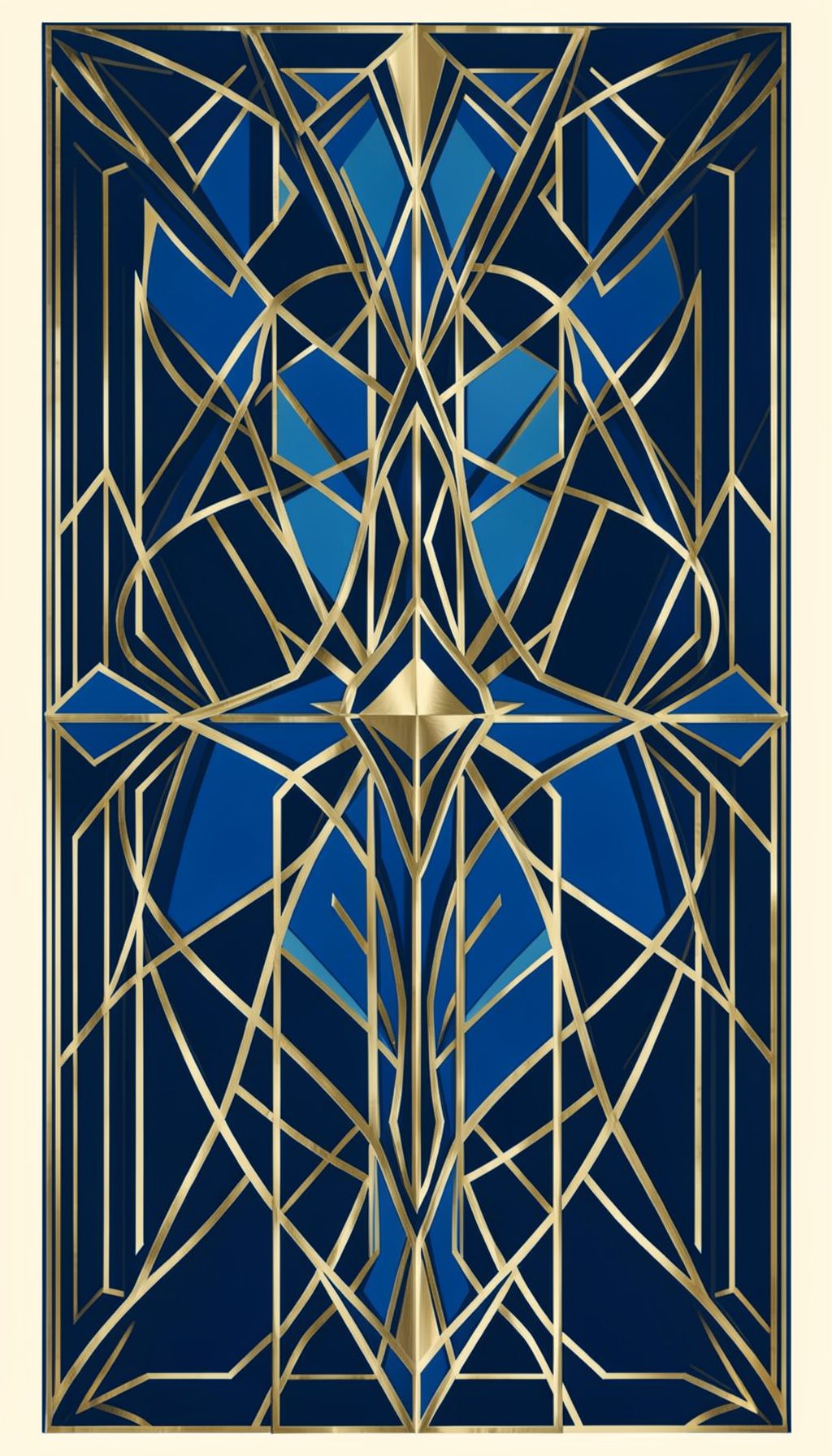
A California-inspired wallpaper design for iPhone, blending hand-lettered type with a warm, sun-faded palette.
Thoughts on design, photography, and the creative process
The creative process is rarely a straight line. More often it resembles a winding conversation, one where you talk through ideas aloud before they take shape on the page. For a designer working across lettering, branding, and editorial projects, that internal dialogue becomes essential. It is where early sketches meet second-guessing, where a loose pencil draft transforms into a refined serif capital. The studio becomes a space for both quiet reflection and playful experimentation. By welcoming the mess of half-formed thoughts, you allow room for unexpected solutions to emerge. The best work often begins not with certainty, but with a willingness to listen to your own rambling mind.
Lettering carries a warmth that type alone cannot replicate. Each curve and stroke carries the mark of a hand, a reminder that design is ultimately a human craft. Whether drawn for a wedding invitation, a magazine spread, or a poster for a local show, hand-drawn letters bring personality and texture to the page. They can feel nostalgic or fresh, playful or refined, depending on the angle of the nib and the pressure of the hand. In an age of digital precision, there remains something deeply satisfying about imperfect, organic forms. That slight wobble in a descender or the uneven weight of a stroke tells a story no algorithm can capture.
A portfolio is never truly finished. It evolves alongside the maker, shifting with each new project, collaboration, and creative risk. For someone working in graphic design, the collection of work reflects not just technical skill but a point of view. Each logo, annual report, or poster becomes a chapter in a larger narrative about problem-solving and visual storytelling. The act of curating a portfolio is itself a design challenge: what to include, what to leave out, how to sequence the work so it breathes. The goal is not to impress with volume, but to invite viewers into a thoughtful, ongoing dialogue.
Photography and design share a quiet kinship. Both are exercises in seeing, in deciding what to frame and what to leave out. A well-composed photograph can inspire a color palette, a texture, or a mood that carries into a branding project. The soft green of a California hillside might become the background tone for a set of wedding materials. The sharp contrast of light and shadow in a portrait might inform the weight of a logotype. By keeping a camera close, a designer trains the eye to notice details others overlook. These small observations, collected over time, become a personal library of visual references that feed every new creative endeavor.
August 12, 2013
A California-inspired wallpaper design for iPhone, blending hand-lettered type with a warm, sun-faded palette.
August 5, 2013
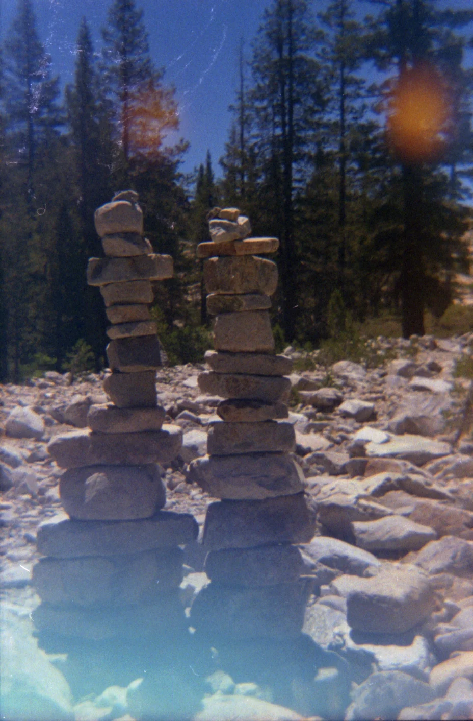
A photo series shot on a Holga camera during a trip through Tahoe National Forest — soft focus, light leaks, and the quiet texture of the Sierra Nevada.
July 2013
Behind-the-scenes process work for Chromatic Magazine, exploring layout grids, type pairing, and the editorial rhythm that shaped the final spreads.
July 2013
A walkthrough of the sketching and refinement stages behind the Golden State lettering piece, from pencil roughs to vector polish.
June 2013
Breaking down the creative decisions behind the California Dreamin' illustration — color studies, composition tests, and the final hand-rendered type.