Gig Posters
Typography and illustration for live music and events
Selected Work
Poster Designs
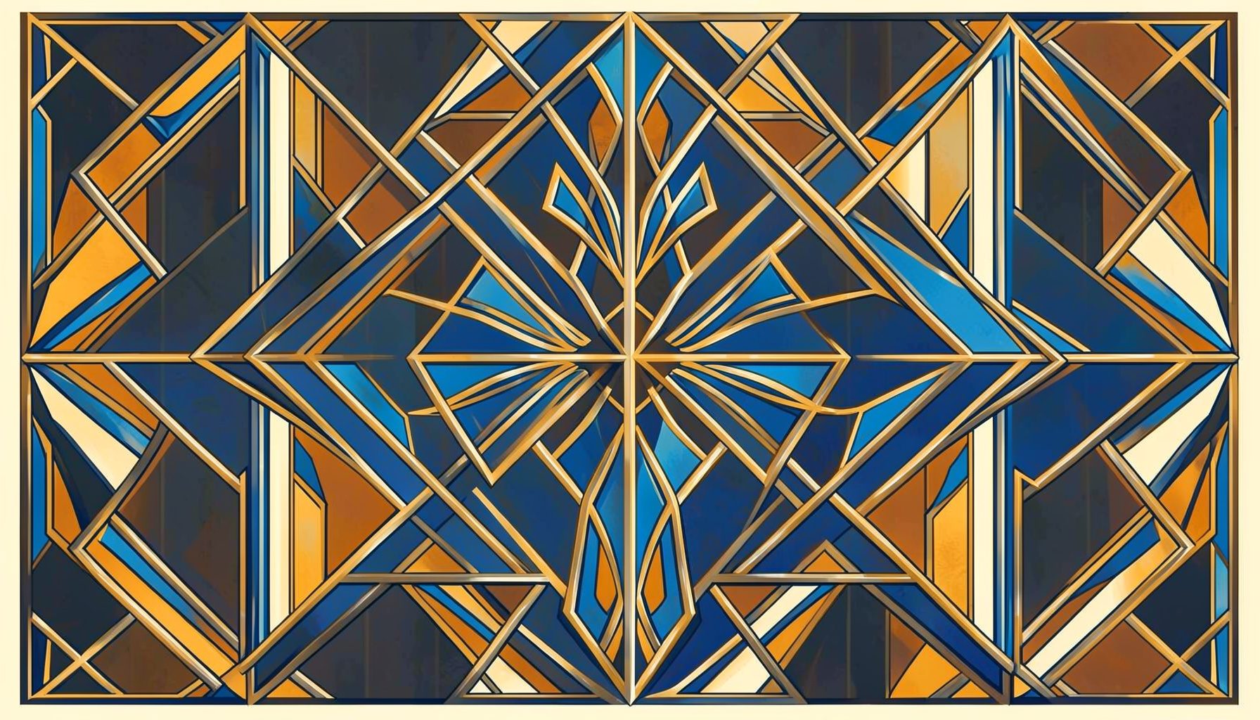
Body Rock Tour
Concert poster series built around bold letterforms and high-contrast palettes, capturing the energy of the tour.
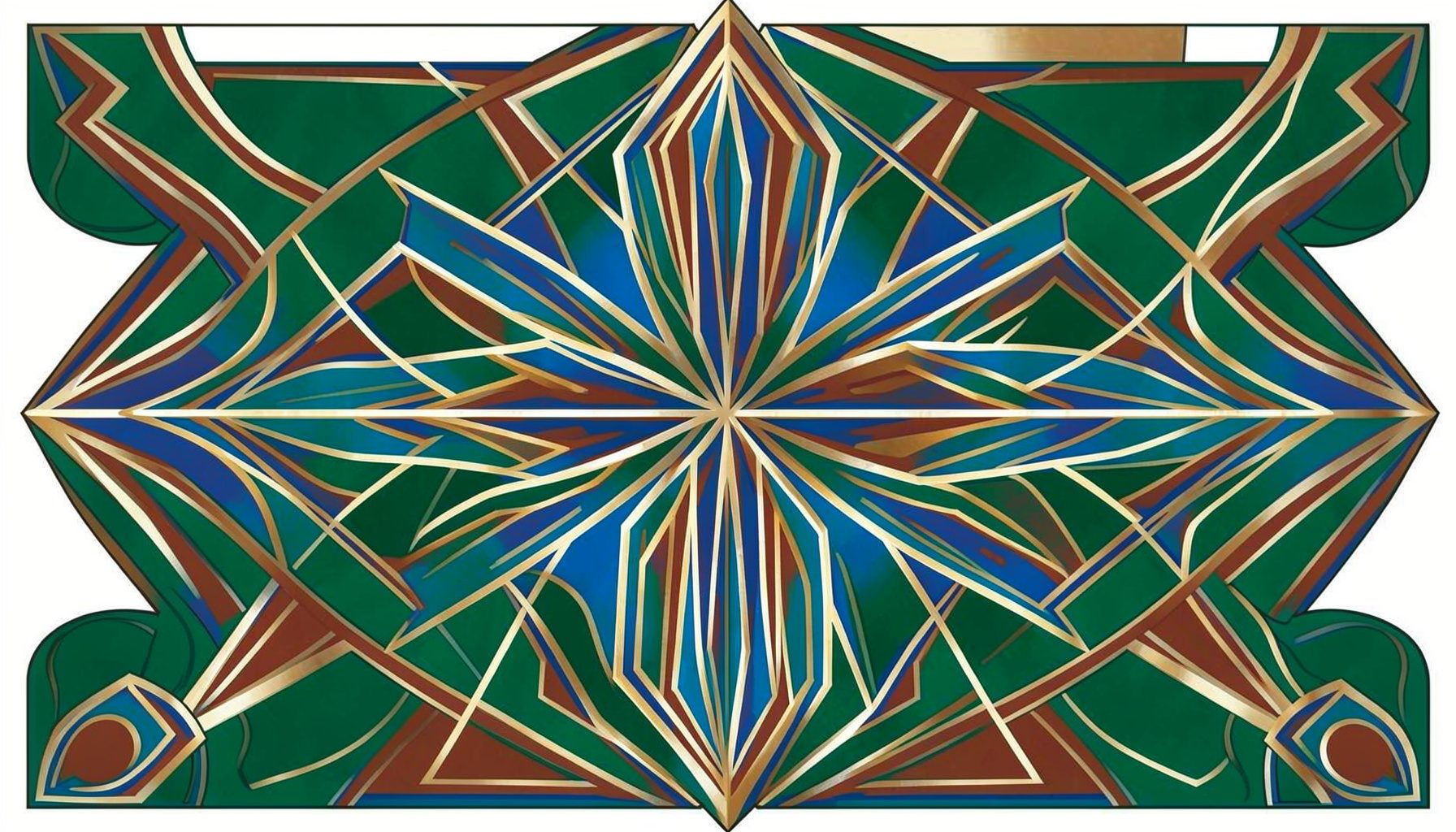
Phlagleblast
Event poster combining hand-drawn type with layered textures for a community music festival.
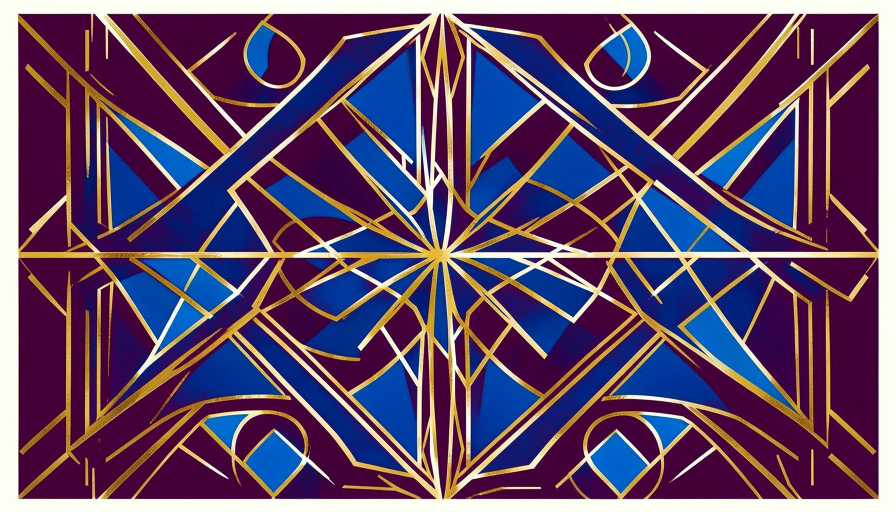
One Nation Print
Screen-printed poster design exploring patriotic motifs through a modern typographic lens.
Approach
From Sketch to Screen Print
Each gig poster begins with hand-drawn lettering studies and rough compositional sketches. The goal is always to capture the spirit of the event — whether it's a raucous tour or a community festival — through type, color, and texture.
Final pieces often move through digital refinement before being prepared for screen printing, where ink on paper brings a tactile quality that digital alone cannot replicate.
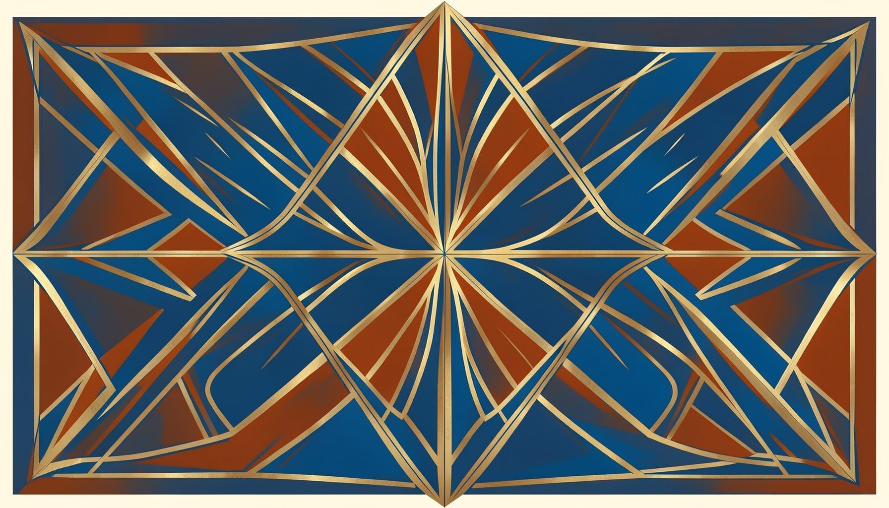
For live music posters, the typography must do more than announce a name and date—it has to channel the raw energy of the performance itself. Bold letterforms become the visual equivalent of a loud guitar riff, while high-contrast color palettes mimic the dramatic shift between stage lights and darkness. Each concert poster in this collection began as hand-drawn lettering studies, sketched out to find the right rhythm and weight before any digital refinement took place. The goal is always to capture the spirit of the show in a single, arresting composition that feels as alive as the event it promotes.
The process behind a great gig poster is part design discipline, part happy accident. Early rough compositional sketches allow for playful exploration of scale and hierarchy, letting the headline act's name dominate the layout while supporting text finds its place naturally. Hand-drawn type brings an irreplaceable warmth and personality that purely digital letterforms often lack. Textures layered into the final artwork—whether from scanned paper, ink splatters, or subtle grain—add depth and a tactile quality that rewards closer inspection. These elements combine to create posters that feel collected rather than merely produced.
Community music festivals present a unique challenge: the poster must feel inclusive and celebratory while still commanding attention on crowded bulletin boards and social media feeds. Hand-drawn typography paired with layered textures creates a sense of handmade authenticity that resonates with festivalgoers seeking genuine experiences. The composition typically balances multiple performer names, dates, and locations without feeling cluttered, using generous spacing and thoughtful hierarchy to guide the viewer's eye. These posters become cherished souvenirs long after the last act has left the stage, serving as tangible memories of shared musical moments.
Screen-printed posters occupy a special place in music culture, valued for their craft and collectibility. Each color layer is carefully planned and separated, with the designer working within the medium's constraints to achieve striking results. Patriotic motifs and cultural iconography can be reimagined through a modern typographic lens, giving familiar symbols fresh relevance. The registration between layers creates subtle imperfections that make each print slightly unique—a quality that digital printing cannot replicate. These limited-edition pieces bridge the gap between graphic design and fine art printmaking.
The portfolio approach to gig posters emphasizes the editorial and scrapbook-like quality of the work. Wide margins around each poster image allow the designs to breathe, while a soft sage background creates a calm, earthy backdrop that lets the vibrant poster colors take center stage. Serif typography throughout the site echoes the classic, rounded letterforms found in the posters themselves, creating a cohesive visual language. The generous spacing and absence of rigid grid structures give the impression of flipping through a curated collection of prints, each one deserving of its own moment.
Interested in a custom poster?
Kyle works with bands, promoters, and event organizers to create posters that stand out. Reach out to discuss your project.