Brand Projects
Typography-driven identity work for established brands
Selected branding and type-based projects that demonstrate the ability to work within established brand guidelines while bringing fresh, hand-crafted lettering to the forefront.
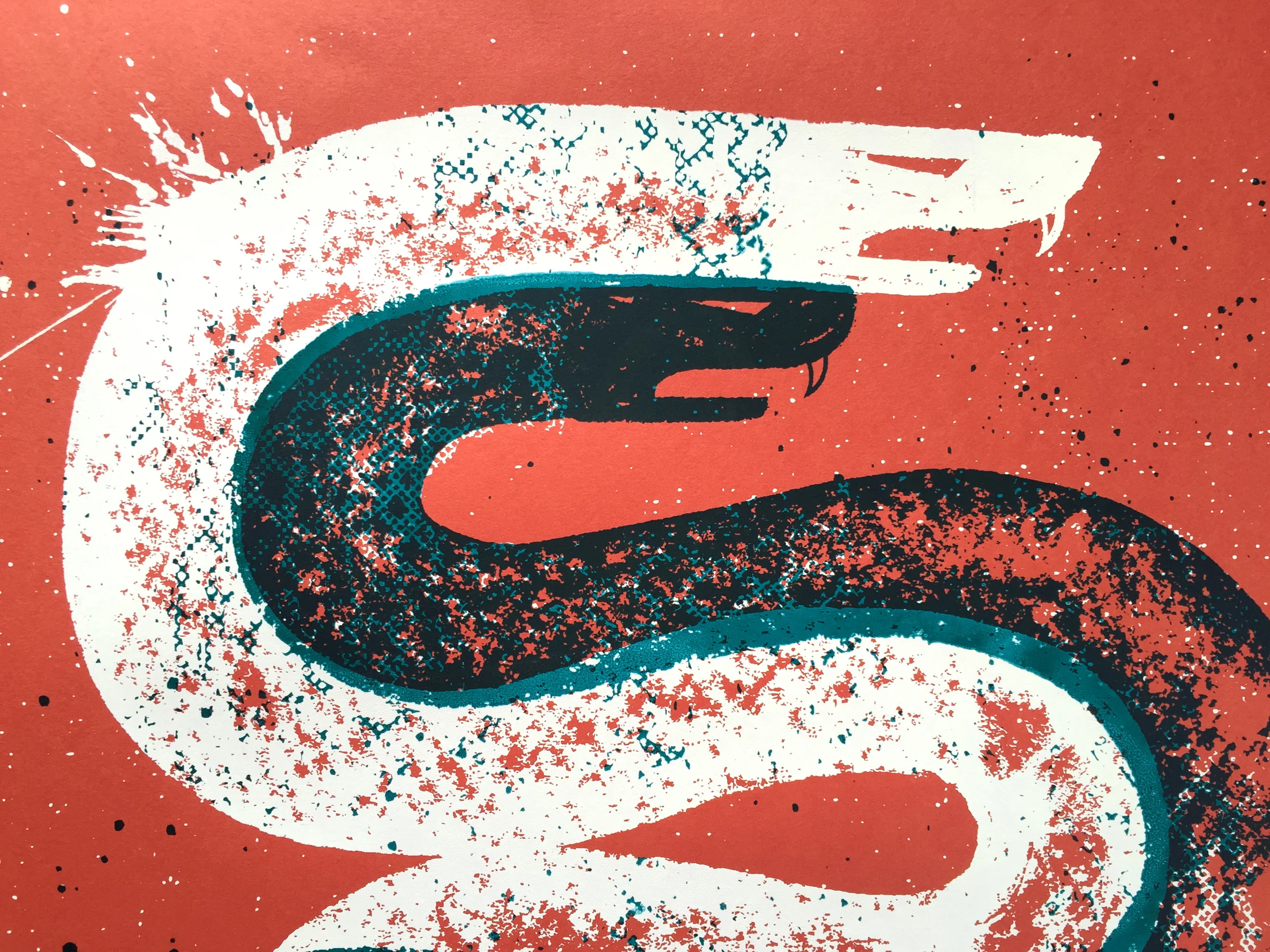
Featured Project
Jack Daniel's Holiday
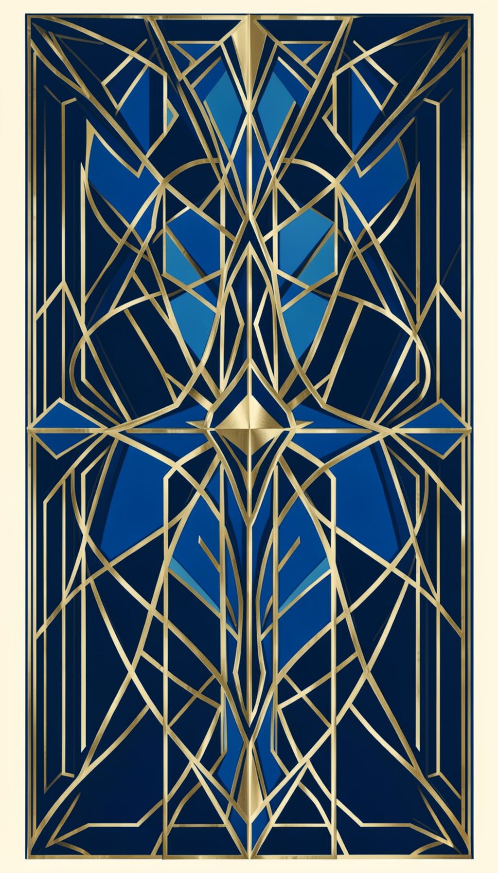
A whiskey-themed typography project created for Jack Daniel's holiday campaign. The work explores rich, warm letterforms that echo the character of the brand — balancing heritage cues with a refined, contemporary hand-lettered approach.
The project highlights the ability to interpret an established brand's visual language through custom type, respecting brand guidelines while introducing distinctive, crafted detail. Deep amber and charcoal tones anchor the compositions, with gold accents that evoke the warmth of the holiday season and the spirit of the product.
This piece sits at the intersection of branding and lettering — where typography becomes the hero of the visual identity.
Working within an established brand's visual language presents a distinct creative challenge, and the Jack Daniel's holiday project embraces that tension with warmth and craft. Rather than reinventing the brand's familiar identity, the lettering draws on the heritage cues that make it recognizable — sturdy serif forms, generous spacing, and a sense of handcrafted permanence — while introducing a contemporary freshness suited to the holiday season. The result feels both timeless and current, the kind of typography that reads as celebratory without losing the grounded, authentic character the brand is known for. It is a study in restraint, where every curve and stroke serves the overall mood rather than competing for attention.
The palette for this project leans into rich, warm tones that echo the amber and caramel notes associated with the season. Deep greens and muted golds sit comfortably against the soft sage background that anchors much of the portfolio, creating a cohesive bridge between the holiday work and the designer's broader aesthetic. Photography plays a supporting role, with the lettering taking center stage as the primary visual voice. The generous whitespace around each composition gives the pieces room to breathe, reinforcing the editorial, print-inspired quality that runs throughout the site — a deliberate departure from the dense, grid-heavy layouts common in digital design.
Typography is the true protagonist here, and the project demonstrates a confident command of letterforms at scale. The main title treatment features large, expressive characters that carry a sense of occasion, while supporting text adopts a lighter serif weight that keeps the hierarchy clear and approachable. This interplay between display and body type is a recurring signature across the portfolio, visible in everything from magazine spreads to wedding stationery. The holiday work proves that even within strict brand guidelines, there is room for personality — the lettering feels unmistakably hand-crafted, yet disciplined enough to honor the system it lives within.
The project also speaks to the broader range of work showcased on the site, where typography-driven identity projects sit alongside editorial layouts, logo designs, and print collateral. This particular piece reflects a versatility that runs through the portfolio — the ability to pivot between playful and refined, casual and formal, depending on the client and the context. The Jack Daniel's holiday campaign, with its balance of heritage and modernity, serves as a strong example of how brand work can remain fresh across seasons and audiences. It is the kind of project that demonstrates both technical skill and thoughtful creative judgment.
For visitors exploring the portfolio, this featured project offers a window into the designer's process and philosophy. The emphasis on hand-lettered detail, careful spacing, and a restrained, print-like aesthetic carries through every section of the site, from the blog and project archives to the contact page. The overall impression is one of a designer who values craft over trend, building work that feels intentional and lasting. Whether the viewer arrives looking for wedding invitations, magazine design, or brand identity work, the Jack Daniel's holiday project stands as a testament to the power of well-considered typography to carry a message with clarity and character.
Approach
Working Within Brand Systems
Brand Immersion
Understanding the existing visual language, heritage, and constraints before putting pencil to paper.
Custom Lettering
Hand-drawn type that respects the brand's DNA while adding warmth and personality that off-the-shelf fonts cannot deliver.

Refined Execution
Polishing letterforms, color palettes, and texture until every detail supports the brand story.