Logo Design
A collection of identity marks and brand symbols
A well-crafted logo is often the quietest yet most memorable element of a brand's identity. It distills a company's story, values, and personality into a single, enduring mark that can speak across cultures and generations. In my approach to logo design, I focus on clarity and longevity, favoring simple shapes and thoughtful negative space over fleeting trends. Each symbol is built to feel both familiar and distinct, drawing from the same earthy, grounded sensibility that runs through all my work. The goal is always to create something that feels effortless, as though the mark had always belonged to the brand it represents.
The process of developing a brand symbol begins long before any lines are drawn on paper. It starts with listening: understanding the client's mission, their audience, and the emotional tone they wish to convey. From there, I sketch freely, exploring dozens of rough concepts before refining the most promising directions. This exploratory phase is where unexpected connections emerge, often inspired by the natural textures, typographic details, and hand-lettering sensibilities that define my broader portfolio. The final mark is then polished with the same care one might give a fine print, ensuring it works beautifully whether embroidered on a cap, stamped on a box, or displayed on a screen.
A successful identity mark must hold its own at any scale, from a tiny social media avatar to a towering storefront sign. This versatility is achieved through rigorous testing and an insistence on strong silhouettes that read clearly even when reduced. I pay close attention to line weight, spacing, and the relationship between positive and negative forms, treating each logo as a miniature composition in its own right. The result is a mark that remains legible and impactful across all applications, from business cards and letterhead to packaging and environmental signage, without ever losing the warmth and character of its original hand-drawn spirit.
Beyond simple recognition, the best logos carry an emotional resonance that invites people to feel connected to a brand. A thoughtful color palette, drawn from the soft sage and deep forest tones that anchor much of my design work, can evoke trust, calm, or quiet confidence. The right letterform, whether a rounded serif or a refined display face, adds a layer of personality that words alone cannot express. Each project becomes a collaboration toward finding that subtle balance between professionalism and approachability, resulting in an identity that feels both intentional and alive, ready to grow alongside the business it represents.
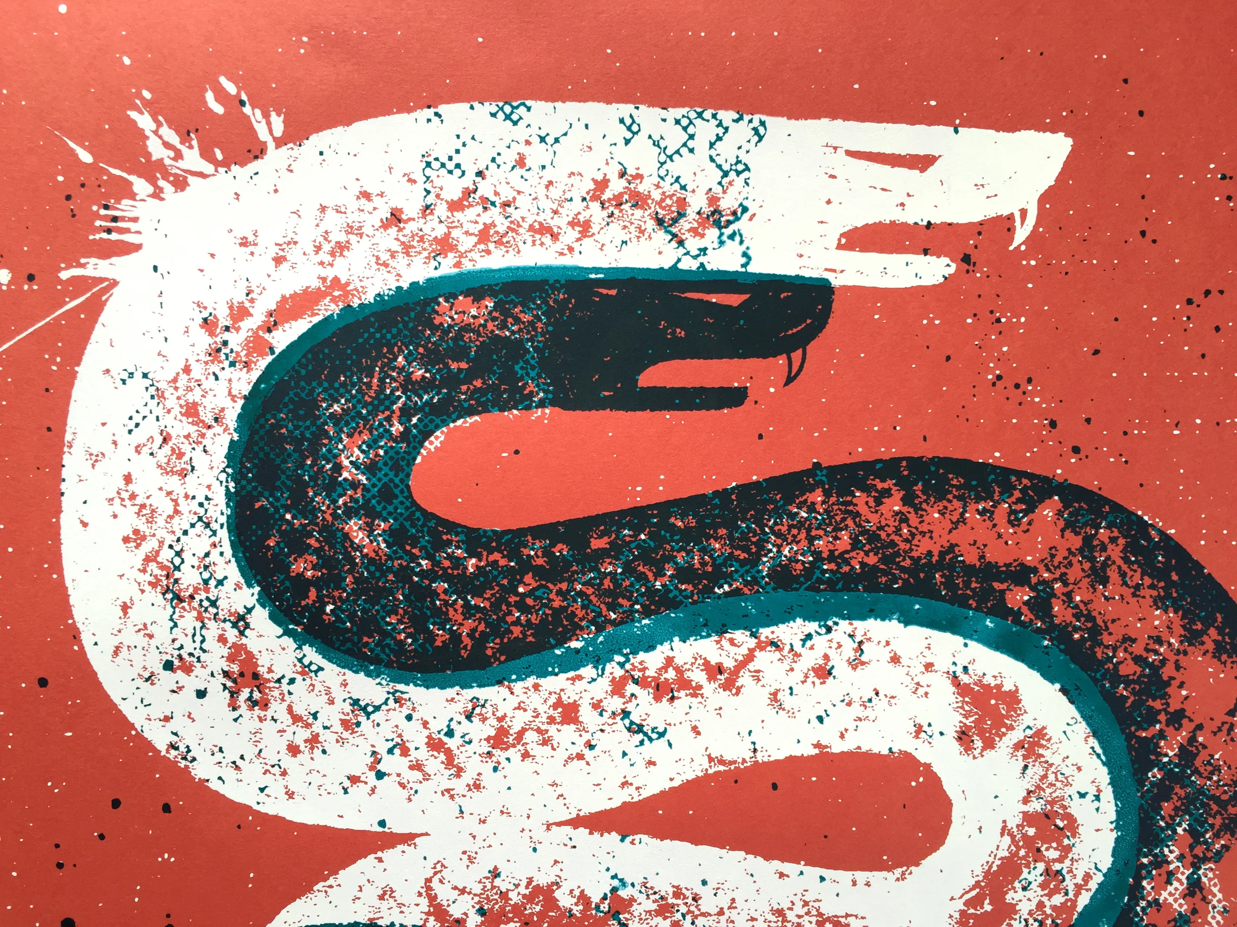
Legit Sactown Magazine
Identity and mark for a Sacramento-based publication.
Girl Talk
Logo and visual identity for a community conversation series.
The California Project
Brand mark for a statewide initiative celebrating California culture.
Group Fit Club
Identity system for a group fitness community.
Early Bloomers Swim Lessons
Logo and brand elements for youth swim instruction.
Edible Sacramento
Identity design for a local food and drink publication.
Sport Icons
Custom icon set for athletic branding and apparel.
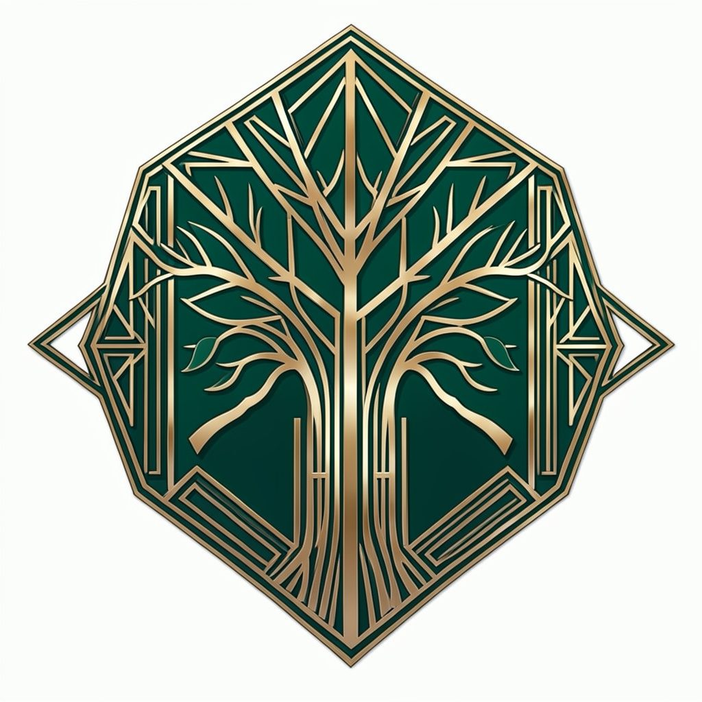
UUOCI Annual Report
Logo and cover design for an organizational annual report.